Card 卡片
卡片组件能够承载与单个主题相关的内容和操作。
卡片是一个显示与单个主题相关的内容和可被操作的容器。
通过卡片组件,扫描相关的和可操作的信息更为便捷了。 像文本和图像这样的元素,则应按照清晰的布局来排列,以此呈现结构层次。
Word of the Day
adjective
well meaning and kindly.
"a benevolent smile"
Word of the Day
adjective
well meaning and kindly.
"a benevolent smile"

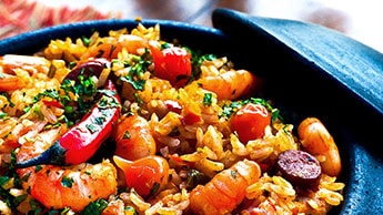
This impressive paella is a perfect party dish and a fun meal to cook together with your guests. Add 1 cup of frozen peas along with the mussels, if you like.

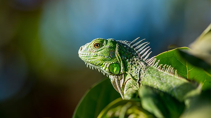
Lizards are a widespread group of squamate reptiles, with over 6,000 species, ranging across all continents except Antarctica
默认情况下,我们结合 <div> 元素和一张 背景图片 来展示多媒体元素。 在某些情况下它也可能会出现问题,例如,你想要显示一个视频或一张响应式的图片。 使用 component 属性可以解决这样的情况:

Lizards are a widespread group of squamate reptiles, with over 6,000 species, ranging across all continents except Antarctica
主要(Primary)操作
Often a card allow users to interact with the entirety of its surface to trigger its main action, be it an expansion, a link to another screen or some other behavior. The action area of the card can be specified by wrapping its contents in a CardActionArea component.
A card can also offer supplemental actions which should stand detached from the main action area in order to avoid event overlap.
UI 控件
Supplemental actions within the card are explicitly called out using icons, text, and UI controls, typically placed at the bottom of the card.
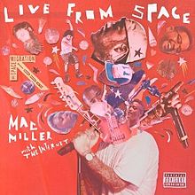
Here's an example of a media control card.

🎨 If you are looking for inspiration, you can check MUI Treasury's customization examples.